
Overview
Acacy Recruitment Platform is a recruitment platform for field workforce roles such as PG, PB, sales staff, supermarket staff, warehouse staff, and other positions related to supply, retail, sales, and market activation.
The project was built in 2023 by a small team: one Business Analyst and one UX/UI Designer.
My role was UX/UI Designer. I worked with the BA on research, data entry definition, data filtering logic, MVP design, prototyping, and handoff using an Ant Design library.
I did not redesign the core HRM system behind the product. Acacy already had internal systems for collecting applications and managing recruitment operations.
My responsibility was to design the front-facing experience: turning fragmented recruitment data into a website/web app that was easy for candidates to use, clear for stakeholders to understand, and professional enough for enterprise pitching with brands such as Samsung, Unilever, and large retail chains.
Why This Project Needed to Exist
Before this project, candidates could discover jobs through many different channels: Facebook posts, Zalo, hotline, website forms, or direct messages.
Operationally, Acacy already had recruitment capability and a system for receiving applications. But the candidate-facing experience was still fragmented. Recruitment data had not yet been presented as a clear, attractive, and trustworthy product experience at the level of the brands Acacy wanted to serve.
The challenge was not simply to create another recruitment website.
The challenge was to create a recruitment experience that could serve three goals at the same time:
Goal | Meaning |
|---|---|
Candidate acquisition | Help candidates find jobs and apply faster. |
Enterprise pitching | Show recruitment capability to Samsung, Unilever, and retail chains. |
Data standardization | Standardize how jobs, locations, salary, brands, and application status are presented. |
Acacy needed a product that was simple enough for everyday candidates, but professional enough to compete and pitch to large enterprise partners.
User Insight
The main users were PG, PB, sales staff, market activation staff, supermarket staff, and other low-barrier workforce candidates.
This was not a user group that wanted to go through a complex recruitment process like LinkedIn or office-worker hiring platforms.
They needed to know quickly:
Where the job is
How much it pays
Whether it is shift-based or campaign-based
Which brand is hiring
How many positions are still available
Whether applying is fast
Where to check the application result
That meant the experience had to start from the two simplest inputs:
Location and phone number.
Location helps candidates see jobs near them.
The phone number becomes the main credential for login, application, and application status checking, instead of forcing users to remember an email or password.
Persona
Primary Persona — PG / PB Candidate
Attribute | Detail |
|---|---|
User type | PG, PB, sales staff, supermarket staff, field staff |
Device | Mostly mobile |
Main goal | Find nearby jobs with clear salary and fast application |
Decision factors | Location, salary range, shift, brand, available slots |
Friction | Does not want complex accounts, long CV creation, or password-based login |
Preferred flow | Choose location → Browse suitable jobs → Enter phone number → Apply → Check result |
Secondary Persona — Recruiter / Operation Team
Attribute | Detail |
|---|---|
User type | Recruiter, recruitment coordinator, operation staff |
Main goal | Receive clearer candidate leads by job, location, and campaign |
Need | More standardized application data, less fragmented sourcing, easier status tracking |
Friction | Leads come from many channels and are hard to standardize or track |
Business Persona — Brand / Client Stakeholder
Attribute | Detail |
|---|---|
User type | Samsung, Unilever, retail chains, internal leadership |
Main goal | Evaluate Acacy’s capability to recruit field workforce at scale |
Need | See geographic coverage, brand credibility, system professionalism, and candidate acquisition speed |
Friction | Hard to trust operational capability if everything is only shown through forms or internal data |
The Real Problem
This was not a normal job board.
A normal job board only needs to post jobs and receive CVs.
Acacy needed a product that could do more:
Help low-tech candidates find jobs quickly
Turn job data into clear entry points
Build trust with large enterprise brands
Standardize how candidates apply and check applications
Present nationwide recruitment capability visually
The biggest problem was not the lack of data.
The problem was that the data had not yet been turned into an experience strong enough for candidates to make decisions and for stakeholders to trust the system.
Core Idea
The core idea was:
Recruitment data should become a decision layer, not just a database.
Instead of only showing a list of jobs, the platform needed to help candidates make faster decisions based on the most important factors:
Location
Salary
Job type
Brand
Store chain
Available slots
Application status
Every job card, filter, category, and search result had to answer one question:
Is this job suitable for me, and can I apply quickly?
Key UX Decisions
Decision | Why | Impact |
|---|---|---|
Location-first onboarding | PG/PB work depends heavily on work location | Candidates see relevant jobs faster |
Phone-first login | Candidates do not need an email/password workflow | Reduces friction for login and application checking |
OTP authentication | Easier than password login for mobile-first users | Reduces forgotten password issues |
Job card-first browsing | Candidates need to scan many jobs quickly | Makes comparison faster |
Salary upfront | Salary is a major decision factor | Helps users skip unsuitable jobs early |
Brand / store-chain grouping | Familiar brands create trust | Increases click and apply intent |
Minimal application form | Candidates do not want complex CV creation | Reduces drop-off |
Application status by credential | Users can check results using their phone number | Reduces dependency on recruiters |
Global search index | Users can search by salary, location, brand, and category | Improves job discovery |
Category-based filter | Job data needs to match real browsing behavior | Makes navigation clearer |
Information Architecture
I designed the content architecture around the main entry points candidates use when looking for work.
Entry Point | User Intent |
|---|---|
Search bar | The user already knows what they want |
Location selector | The user wants a job near where they live |
Job category | The user wants to browse by type of work |
Salary range | The user prioritizes income |
Brand / chain | The user trusts familiar brands |
Popular jobs | The user wants to see what is currently in demand |
High salary jobs | The user prioritizes higher-paying jobs |
Student jobs | The user is a student or needs flexible work |
Blog / guide | The user needs help understanding the application process |
The same recruitment data was reorganized into multiple discovery paths to support different job-seeking behaviors.
What I Designed
The main screens and flows I designed included:
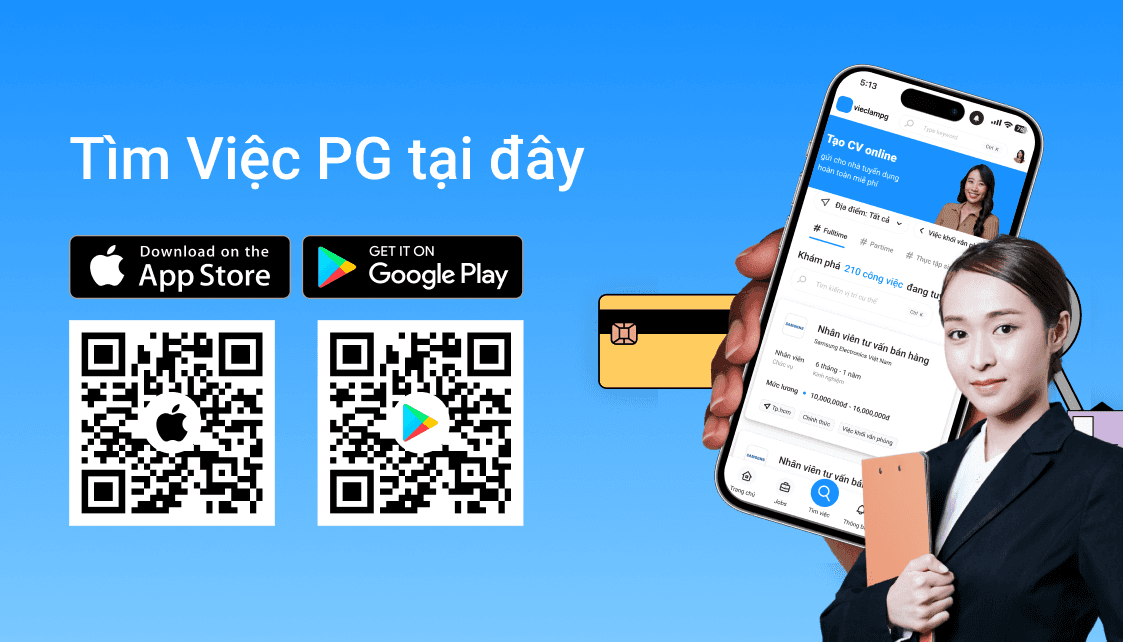
Homepage
Job listing
Job detail
Login / register
OTP flow
Application status
Category menu
Global search
Filter by location, salary, and job type
App-like mobile web experience
Company / partner section
Blog / hiring guide
SEO keyword sections
Footer structure
Ant Design handoff library
The homepage was required to feel more “wow” and differentiated from competitors, because it did not only serve candidates. It also acted as a pitching surface for brands and stakeholders.
Data-Driven UX
Recruitment data was translated into UI patterns that were easier to scan and act on.
The main data fields included:
Data | UX Usage |
|---|---|
Job title | Identifies the role |
Salary | Helps candidates decide faster |
Location | Matches users by area |
Brand | Builds trust |
Store chain | Helps users search by retail chain |
Job type | Full-time, part-time, campaign-based, hourly |
Gender requirement | Application condition |
Age requirement | Application condition |
Experience | Suitability signal |
Slots available | Creates urgency |
Application status | Allows candidates to track results |
Recruiter contact | Supports confirmation when needed |
One important detail was that a single job could have multiple locations and multiple available slots. Because of that, the index page needed to expose enough metadata so users could understand whether a job still had a suitable location for them.
Candidate Flow
The main candidate flow was designed to be as simple as possible:
The goal was to let candidates move from job discovery to application without creating a complex account or uploading a CV at the beginning.
Pitching Layer
The product was not only a recruitment website.
It was also a sales asset for Acacy.
The website needed to communicate:
High-volume recruitment capability
Geographic coverage
Brand credibility
A professional system
Fast candidate acquisition
Standardized recruitment data
This is why the homepage was designed as a hybrid between a job discovery page and an enterprise pitch page.
On one side, candidates could find jobs and apply.
On the other side, large brands could see Acacy’s operational capability at a national scale.
Outcome
The project was launched and used in production.
Outcome | Detail |
|---|---|
Status | Launched |
Usage | Used in production |
Business use | Used for enterprise pitching |
Clients | Supported Samsung and Unilever recruitment contexts |
Result | Successful pitching and budget approval |
Metrics | Some job, candidate, and apply-rate metrics are not disclosed due to NDA |
Although many metrics could not be disclosed, the main value of the project was turning internal recruitment data into a product that could be used, presented, and trusted by stakeholders.
What I Learned
This project helped me better understand how to design for low-tech user groups.
Good UX for this group is not about adding more features.
It is about removing unnecessary steps.
A phone number can be a better identity layer than email.
Location can matter more than job title.
Salary can matter more than a long description.
And in a recruitment product, data is only valuable when it helps users make decisions faster.
The biggest lesson was:
Design is not only about displaying data.
Design is deciding which data matters, when it should appear, and how it helps users act faster.
For Acacy, I did not design an HRM system.
I designed an experience layer that made recruitment data easier to understand, easier to search, easier to apply to, and trustworthy enough for both candidates and enterprise clients.
0 views
Likes
Comment