

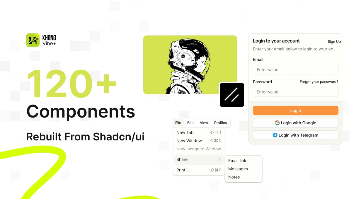
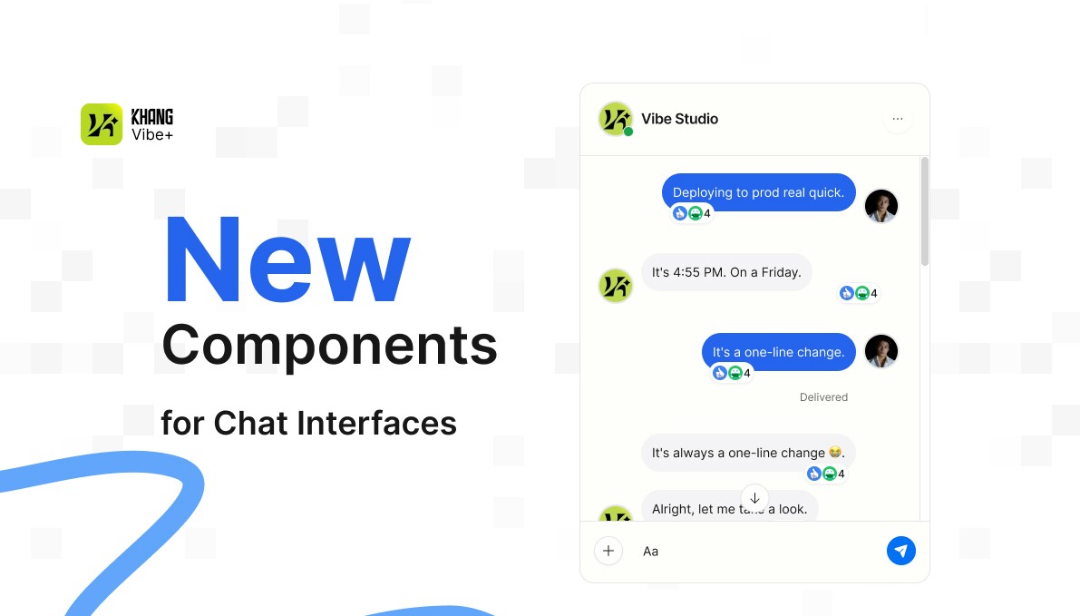
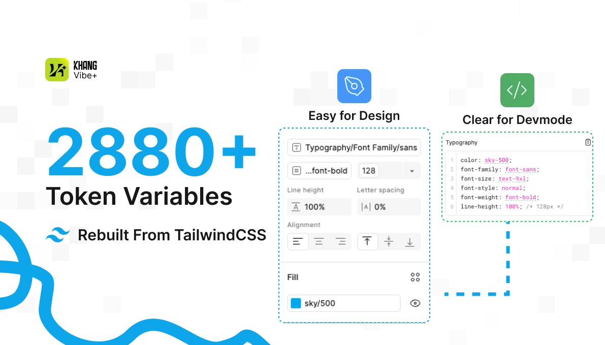

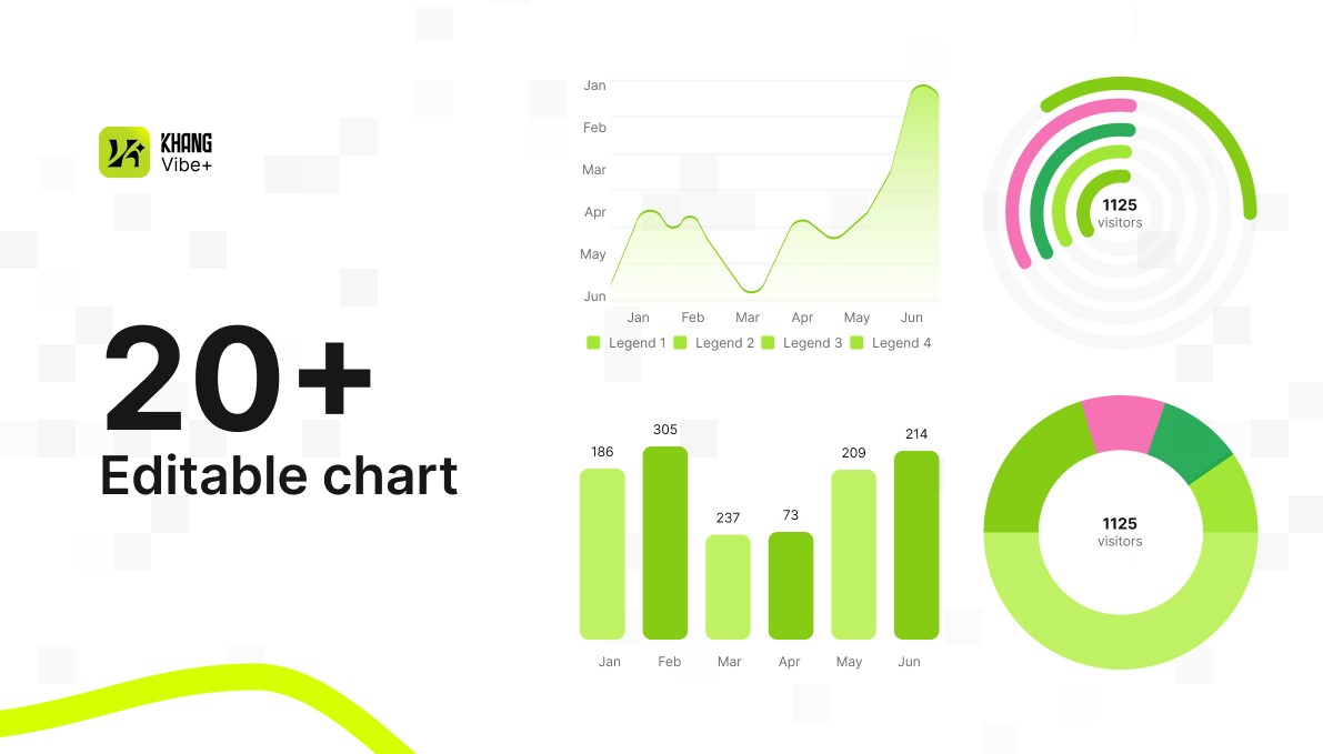
Shadcn/ui Figma Library is a design system I built to bring the principles of shadcn/ui, Tailwind CSS, and component-driven development into Figma. The goal is not simply to recreate interfaces, but to help designers use the right tokens, spacing, states, and component structures so handoffs to developers are clearer.
Why I built the library
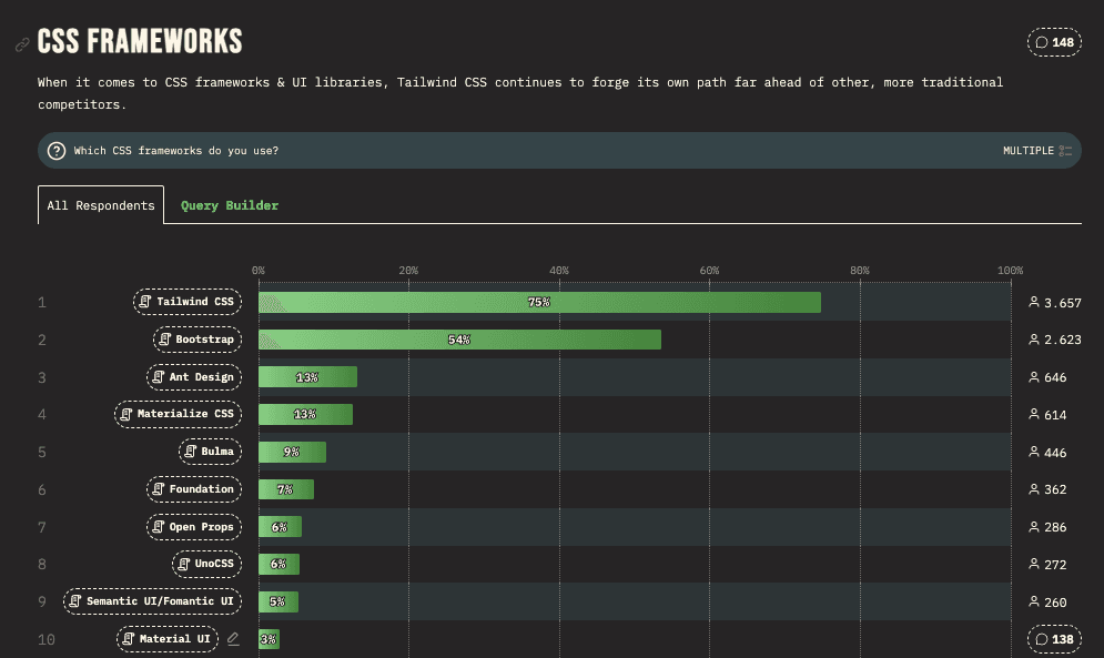
Interface development is moving away from closed component suites like MUI and Ant Design toward more flexible systems built on tokens and primitives, with product teams owning their components.
Shift | What is changing |
|---|---|
Styling | Tailwind CSS makes styling faster and more closely tied to tokens. |
Primitives | Radix UI provides accessibility and interaction logic. |
Ownership | Teams want to own their components instead of depending on closed packages. |
Speed | MVPs, POCs, and dashboards need to be built quickly without becoming difficult to maintain. |
Handoff | Figma needs to align more closely with tokens, component structure, and implementation logic. |
For small product teams, building a design system from scratch takes significant resources. I chose a more practical approach: building on frontend ecosystems trusted by the community, such as Tailwind CSS, Radix UI, and shadcn/ui, then creating a Figma layer that fits the design workflow.
Core idea
This library is not just about dragging components onto a Figma canvas. It helps designers use the right tokens, spacing, states, and component structures, making files easier for developers to understand and reducing the need for lengthy handoff explanations.
In design | In code | How the library handles it |
|---|---|---|
Component | shadcn/ui component | Organized to stay close to the original API documentation and component structure. |
Token | Tailwind class / CSS variable | Maps colors, spacing, and corner radii through tokens. |
Variant | Component state | Clearly separates default, hover, focus, disabled, and error states. |
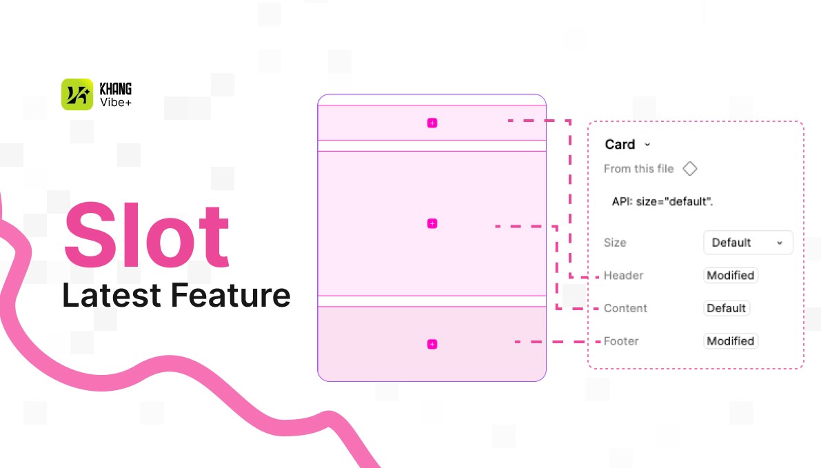
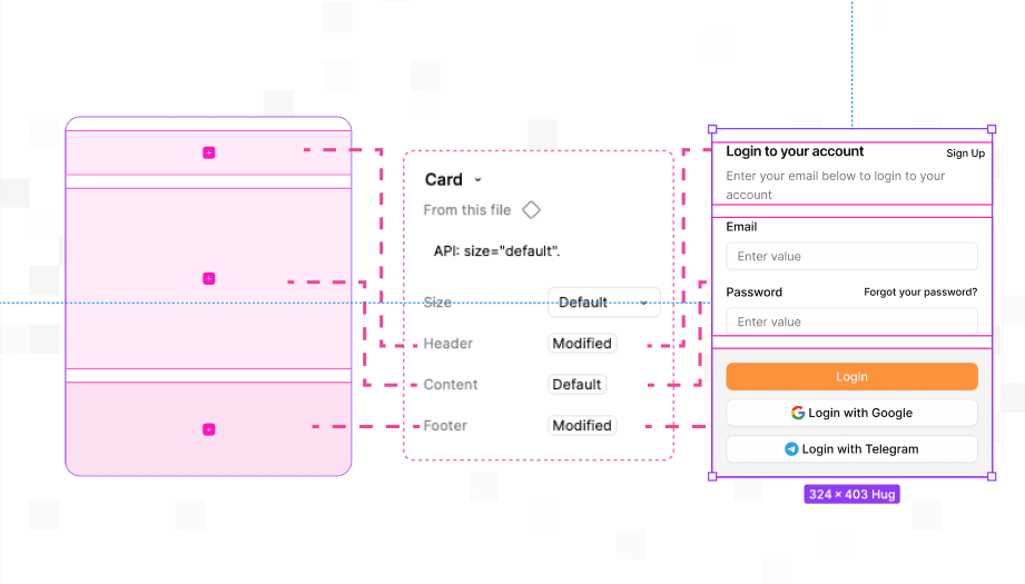
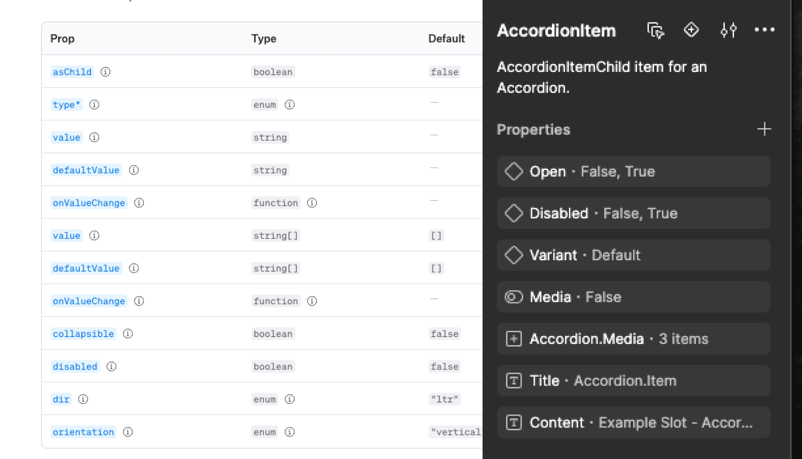
Slot | Composing components with slots | Uses nested instances and wrappers to model slot-based composition. |
Naming | Component structure | Keep names such as |
Handoff | Implementation intent | Clarifies which parts should follow the source system and which can be customized. |
Approach
I did not build the system by manually drawing every component and token. For a system like shadcn/ui combined with Tailwind CSS, that approach would be slow and error-prone. I used AI agents and Figma automation for repetitive work, while focusing my effort on the system's underlying logic.
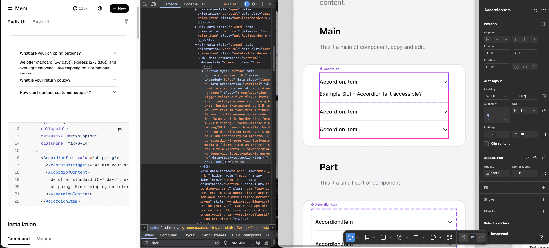
Define the structure
Map Tailwind variables, semantic tokens, component structures, slots, states, and handoff guidelines.
Generate tokens
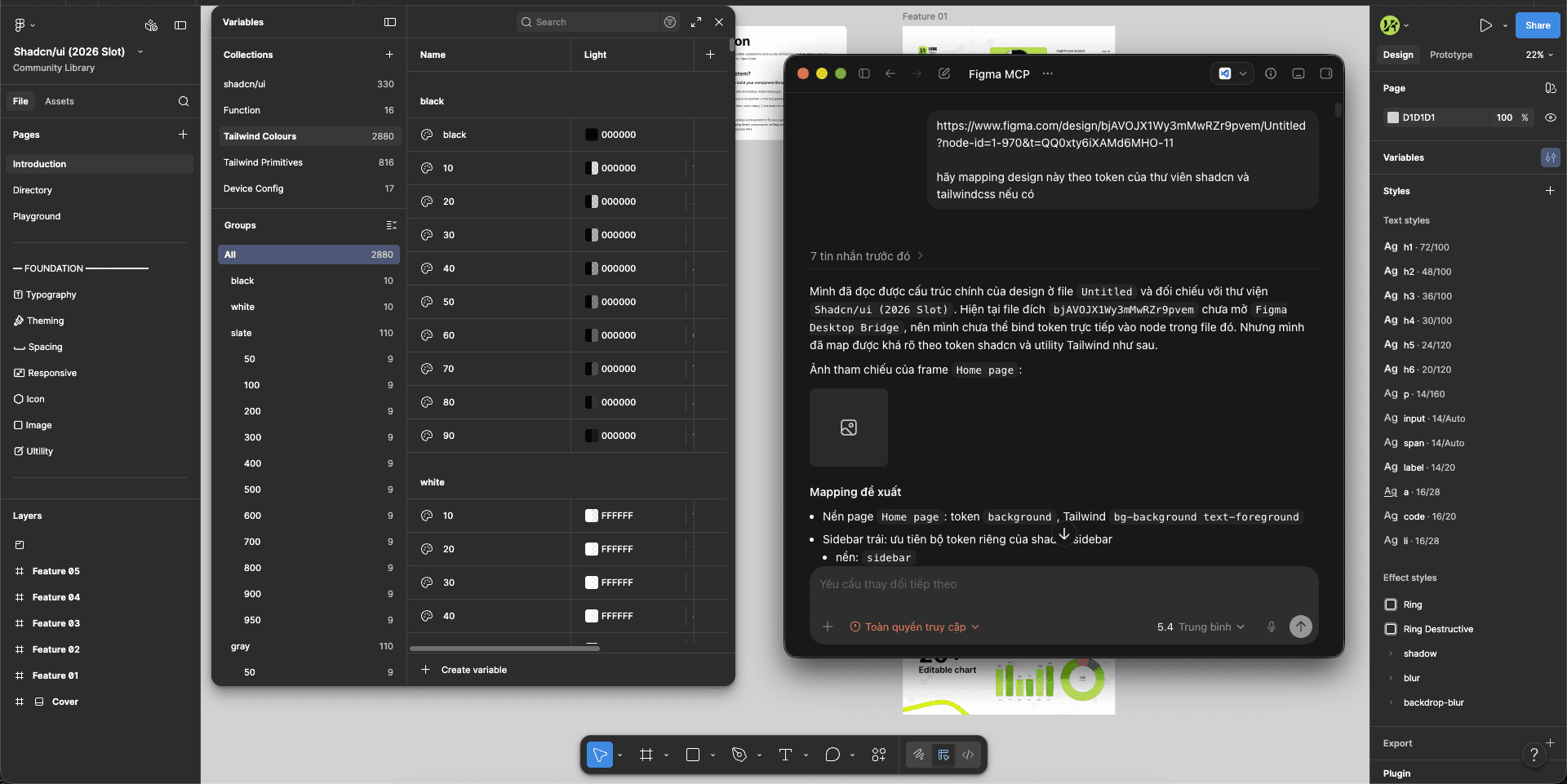
Used an AI agent through the Figma MCP Console to generate more than 2,800 Tailwind variables quickly.
Standardize naming
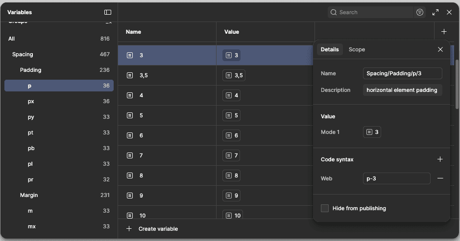
Reviewed naming conventions, group hierarchy, syntax, and spacing groups such as p, pr, pl, px and py.
Build slots
Used Instance Utils to model slot structures with wrappers and nested instances.
Translate the logic
Kept only the logic that helps designers work faster and makes files easier for developers to understand.
Validation and results
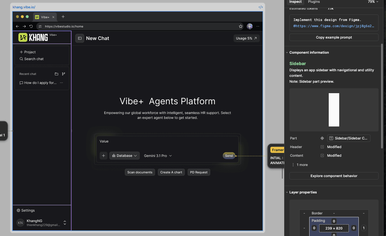
I tested the library in real finance and AI projects built with React. Clearer component structures, token usage, and state definitions reduced Figma comments and follow-up questions between PMs and developers during handoff.
Result: 10x faster delivery with one designer
The first design version was completed in two weeks, helping the project finish roughly three months ahead of its original schedule.
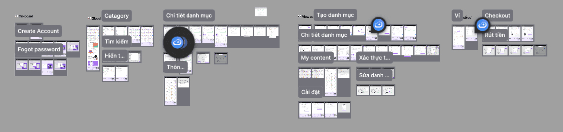
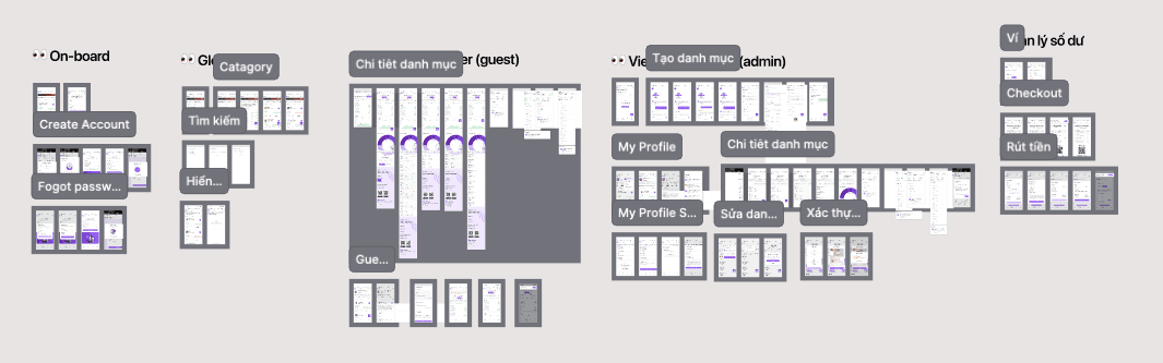
Fewer Figma comments: reduced clarification between PMs and developers during handoff.
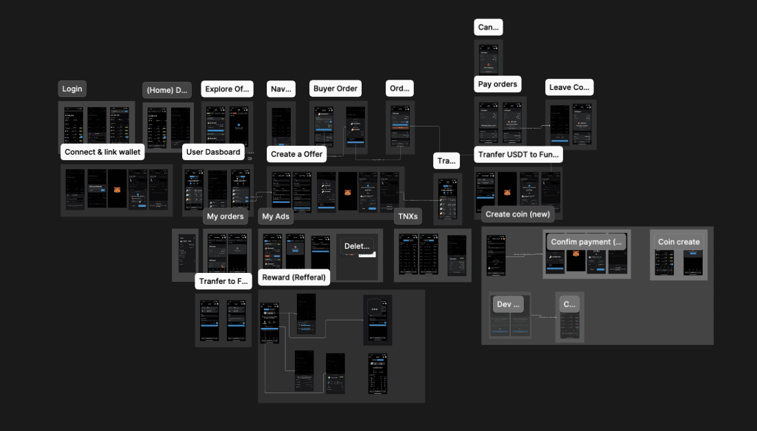
Clearer interface handoff: developers could inspect states, tokens, and component structures with less guesswork.
Community adoption
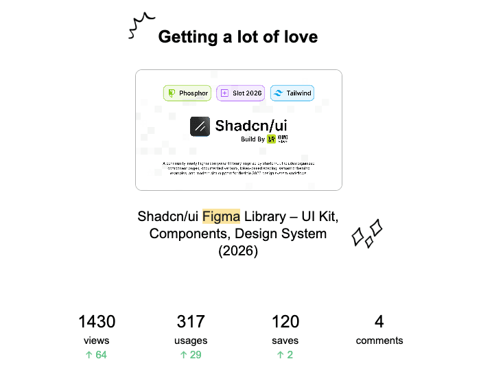
The library was not only saved for reference; the community also opened, used, and tested it in real projects. This interest confirmed the need for a more approachable shadcn/ui Figma library, closer to Tailwind and more practical for product interface design.
Share to
Presentation